Adding a new button to creaContours

After taking a quick look at creaContours' interface, it's easy to agree that buttons are a very important part of it! Adding, editing and deleting contours; extracting statistical data; performing basic and complex segmentation. All this is accomplished by pressing on the right button.

This guide is concerned with the process of adding a new button to creaContours. For that purpose, a detailed how-to guide is included in this documentation alongside a sequence diagram that serves as an example of the process that takes place once a button is pressed.
It also details the process of displaying a panel, often used alongside buttons to configure the different segmentation tools offered by creaContours. Finally, a short tutorial on adding a new contour-drawing button is included.

  1. Finding where to start. How to figure out where to start writing the code that will let you add a new button to creaContours.
  2. Adding the button. As soon as we've found the right place to start, we have to add the actual button. Here such process is detailed.
  3. The callback function. It's not enough to add a new button; a functionality must be associated to it. Here we describe how to create the callback function, which does just that.
  4. The callback action. Once the callback function is called, something must happen. To explain how to assign a callback action to a button (and its respective function) is the objective of this section.
  5. Button-click pipeline. The sequence diagram which shows the pipeline the program goes through when a button is clicked.
  6. Adding a panel. What if the functionality associated to a button requires the user to configure a few parameters? In that case, it could be useful to have a panel. Here we show how to create and display one.

1. Finding where to start

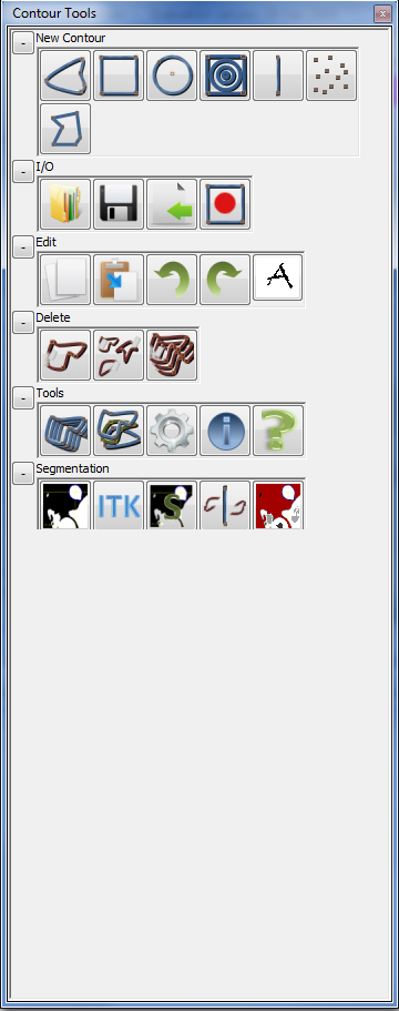
Taking a cursory look at creaContours' buttons panel, one can easily see that its buttons are divided into categories: "New Contour" buttons, "I/O" buttons, etc. This division of the interface is not arbitrary and suggests that before creating a new button one has to decide into which category it'll fit! Will it let the user perform a new kind of segmentation? If yes, it must be added to the "Segmentation" categories. Or will it permit the serial lecture of many contour .roi files? Should it be that way, "I/O" is the place to go.

Image which shows creaContours' button panel, in which one can find all of the buttons that form the core of the application's functionality
Figure [1]. Button panel (creaContours).
As soon as the correct placement of the button has been decided, the next step is to write the necessary code so that it is correctly added to the interface. Remembering that creaContours' <link>architecture<link> is divided into three main components, this would mean first identifying in which one of these the modifcations have to be made.

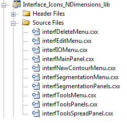
kernel_ManagerContour_NDimensions_lib is constituted by the building blocks of <link>creaContours<link>. This is the where the most basic classes of the application are and as such it's not the right place to look. Interface_ManagerContour_NDimensions_lib contains many visual elements and sembles to be a good choice to look in. But in reality, this library deals with the creation and edition of contours and the management of "main" interface. It is therefore a high level representation of the interface. This leaves only one option...

Image which graphically displays the classes that are within the Interface_Icons_NDimensions_lib library
Figure [2]. Interface_Icon_NDimensions_lib, where new buttons are added
This is clearly the right place! Each of the button panel's categories is represented by a class, named accordingly: "interfIOMenu" is where the buttons corresponding to the "I/O" category are. Having finally found where to start, we must now choose which kind of button we want to create so that we modify the appropriate class. Since the process is similar for each category, we will choose an arbitrary one to illustrate the process; "I/O" in this case.
Back to top

2. Adding the button

Now that we have choosen which kind of button to add, we can take a good look to the corresponding class. As we just said, we're going to add a new "I/O" button. It is therefore in interfIOMenu where we have to look.

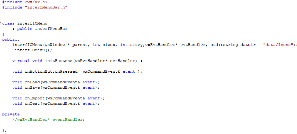
This image shows the code contained within the hader file of the interfIOMenu class
Figure [3]. Header file of interfIOMenu
Taking a quick look a it we can identify the usual constructor/destructor pair and a virtual "initButtons" method. Each class that represents a button category must have implimented this virtual method, where all of the buttons that belong to it have to be created and added. Other than that, there is a method for each of the functions performed by each of the category's button. In this case, "I/O" contains the Load, Save and Import buttons and therefore there is a "On" method for each function. These functions receive as parameters wxCommandEvent events. This basic structure is replicated in each category class (interfSegmentationMenu, interfToolsMenu, etc).

Hence, in order to add the new button we must go to the initButtons method in the .cxx.

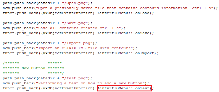
Code where a new button is added to the category. The image also shows what's to be written when adding a new button.
Figure [4].  Where to add the new button.
As we can see, adding a new button it's just a matter or replicating the code that's been already written for the previous buttons. In this case, we have added a new test button, underneath the big "New Button" heading. In orther for this to work as expected, it's necessary to add the button's image (in this case, test.png Image which is shown over the test button once it is sucessfully added to the interface) to the data/Icons folder of the creaContours' CMake project. It's also worth nothing that once a button is being added, its callback function it's specified. In this case, it's the function OnTest, as shown in Figure [4], which must also be added to the header file. If we go back to it in Figure [3] we'll notice that it's already there.

If we run the application now, we'll see that the button's been successfully added to the interface. Finally, the callback function has to be written!
Back to top

3. The callback function

We now have a new button in our interface.
In this image we can see the original I/O buttons alongside the new test button
Figure [5]. The I/O buttons alongside the new test button.
It's time to create a new callback function to associate a function to it. For that purpose, we take a look at the existing callback functions.

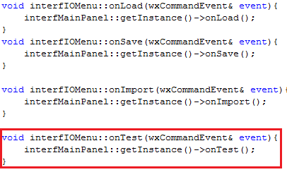
Image which shows the code of the existing callback functions as well as that of the new callback function. The latter is marked in red.
Figure [6]. The callback functions for each of the buttons.
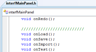
As we can see, all that this function does is call the corresponding callback function on the interfMainPanel class. This mean that there we'll have to define at least one more callback function! The first step is to find the interfMainPanel class header file (interfMainPanel.h) and include a new function, "OnTest".

An image which shows how in the interfMainPanel class the callback functions are defined
Figure [7]. The callback functions in interfMainPanel.
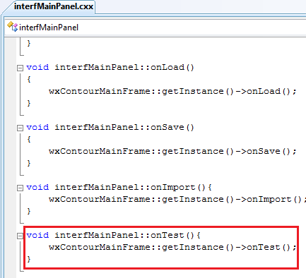
By principle, interfMainPanel is not a class where the "business logic" is to be defined. It can be thought of as the agglomeration of the different menu categories. We can thus expect the onLoad, onSave, onImport and onTest functions to simply call another function on a class where it's pertinent to perform the callback action. Taking a look at the interfMainPanel.cxx file, we find out that this is effectively the case.

An image that shows the piece of code where the interfMainPanel's callback function are defined (for the I/O menu category)
Figure [8].  The callback functions in the interfMainPanel class.
Once again, we see that we have to go deeper into <link>creaContours'<link> architecture. Each callback function calls another function in another class, this time the wxContourMainFrame class. But we're finally getting closer!

4. The callback action

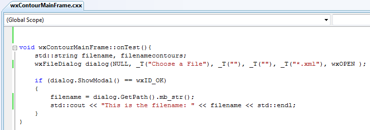
Since we must define a new callback function within wxContourMainFrame, it goes without saying that it's declaration must be included in this class' header file. Having done that, it's time to define the actual callback function. Now, as wxContourMainFrame is where all callback functions eventually end up, this is where the callback action has to be defined. A callback action can be many things: opening a new window, showing a new panel to configure the parameters of a segmentation (and then execute it by pressing on the appropiate button) or drawing a new contour. For this part of the example, we'll be satisfied by just showing a File Selector window.

The code that shows the callback action code that's necessary so that a File Selector pops up when clicking on the button
Figure [9].  The callback action, opening a file selector window.
 And that's it! Now, we have to run creaContours and click on the newly created button... and the File Selector window will pop up!
Image which shows the file selector window being shown once one clicks on the newly created button
Figure [10]. The file selector window pops up!

5. Button-click pipeline (sequence diagram)

6. Adding a panel

It must be said that a button that shows a file selector window is not really the most interesting thing that can be done. By playing around for a bit with creaContours' other buttons, we'll quickly notice that many of them add small panels to the space underneath all the buttons. These panels let the user configure the parameters of the function associated to the button's he's pressed. These panels are particularly important when doing segmentations. As one of creaContours' main functions is to let the user segment the images he's working with, knowing how to create a panel and use it afterwards it's very important. This part of the guide deals precisely with this process.

We'll start with the button that we just created, which causes a file selector window to pop up. In order to add a panel to the window, we follow the same process until the onTest method in interfMainPanel. This is where the process starts to diverge as it is precisely in this method where we'll create the panel and add it to the window.

However, before doing that, we have created the panel that we're going to add!

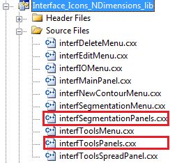
At this moment we can pose ourselves the questions: where exactly do we have to add this new panel? Let's take a look at Interface_Icons_NDimensions_lib, where all of creaContours' graphical elements are to be found:
Image which shows creaContours' graphical classes, with the panel classes being highlighted
Figure [11]. The panel classes highlighted
Clearly, interfSegmentationPanels.cxx and interfToolsPanels.cxx are the two files we have to take a look at! Intuitively, we know that the prefix associated to each class (SegmentationPanels and ToolsPanels) represents to which button category the panels belong to it. The former are the panels that are displayed once we press on a segmentation button; the latter are the panels that are displayed once we press on a Tools button. For the purpose of this guide, we will assume that our button is going to be a Segmentation Button and therefore the panel associated to it will be added to interfSegmentationPanels.

As a matter of fact, these two files have within them the definition of each panel that makes part of each particular category. For example, if we go to interfSegmentationPanels.cxx and examine which class definitions are contained within it, we'll see that there's three, one for each panel.

Image which shows that within the interfSegmentationPanels.cxx file there's 3 class definiotns
Figure [12]. The three classes inside the interfSegmentationPanel class
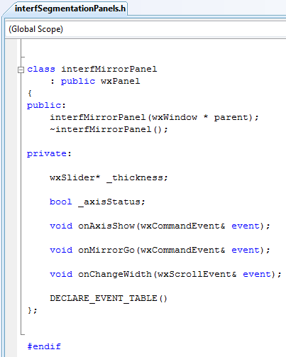
If we know look at the interfSegmentationPanels.h file, we'll see that in it there's a brief definition of each of the three aforementioned classes. This is where we must start, then. To get an idea of how to proceed, let's look at the class definition for interfMirrorPanel:
Fragment of code whiwh shows the definition of the interfMirrorPanel class
Figure [13]. The definition of the interfMirrorPanel class.
As we can see, the class in itself it's not very complicated, but this is also because the panel that it represents is fairly basic. Let's take a quick look at it:
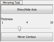
Image which shows the mirroring segmentation panel, in order to give the reader a rough idea of its graphical distribution
Figure [14]. The graphical distribution of the mirroring panel.
What we're going to try to achieve in this guide is actually a very similar panel; it'll have just two buttons, each one of which will have an associated functionality. We must begin by writing down the class definition of our new panel, that we'll name interfTestPanel. Following the pattern shown above, we'll have:
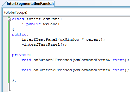
Fragment of code showing the declaration of the new panel
Figure [15]. The declaration of the interfTestPanel class.
As we can see, we have two methods, onButton1Pressed and onButton2Pressed, which receive two wxCommandEvent& events. These are the callback methods that are called once we click on a button.

Now that we have our class definition, we proceed to declare each method of our class.
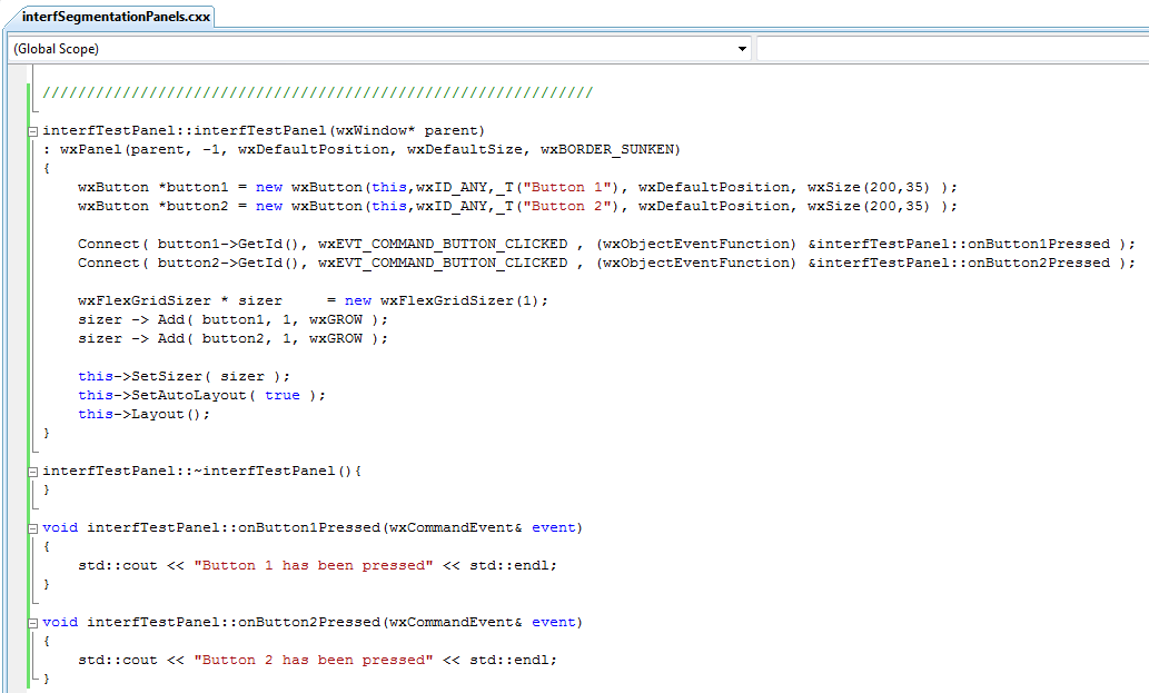
The full declaration of the interfTestPanel class
Figure [16]. The declaration of the new interfTestPanel class
The button callback methods, as we can see, do nothing in particular; they just print into std::cout a message informing the use that the respective button's been pressed. Inside the constructor, we create both buttons as new wxButtons. These take as parameters the panel into which they're going to be added, an ID, a label, and a position. Explaining in detail these parameters (as well as those used in the call to the wxPanel constructor) goes beyond the scope of this guide.

We associated an event to each button with the Connect method. In this case it's a wxEVT_COMMAND_BUTTON_CLICKED event. Furthermore, each button has an associated callback function, which must also be specified through the Connect method. The wxFlexGridSizer which is added immediately afterwards serves as a way to organize the elements on the interface.

Having done that, we must now make sure that once we click on our button the panel is added to the interface. In order to make sure of this, we have to remember the "pipeline" that is followed when we click on a button. This time around, we will folllow it all the way to the "onTest" method in interfMainPanel, as it's here that we have the necessary tools to display our new panel. Before getting down to it, we have to add to new parameters to the interfMainPanel.h file:
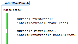
Fragment of code which shows the new parameters added to an existing class so that the new panels can be created
Figure [17]. The declaration of the new panel parameters.
The first parameter is a regular wxPanel which will contain within it the actual interfTestPanel, which is the second parameter that's been added. As soon as we have them in our header file, we can go to the OnTest method and modify it so the panel is shown in the right place. Basing ourselves on the existing onMirrorPressed method, we get the following code which does exactly what we want it to:
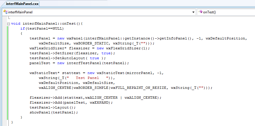
Fragment of code which shows where the panel is actually shown
Figure [18]. The fragment of code that serves to show the new panel
What is done here is actually quite simple. The new testPanel (of object type wxPanel) contains within it the panel where the actual test panel is going to be added. In other words, this is where we will store an instance of the space underneath  the buttons, represented as a panel. Having created it, we further configure it before creating an instance of the actual interfMirrorPanel.  This is added to the wxFlexGridSizer which in turn has been set as the testPanel's Sizer. It is why by doing so we're adding the interfMirrorPanel to the space beneath the buttons, which is exactly what we wanted to do! We end by adding a little bit of text (just for the purpose of staying close to the other, already existing buttons) and we end by showing our panel by invoking the showPanel method and passing it an instance of testPanel, which now contains within it the interfMirrorPanel.

If we now run the interface and click on the new button, we'll obtain the following result...
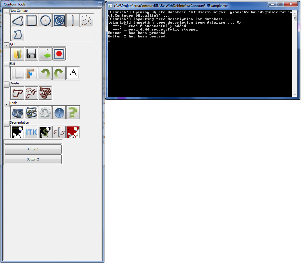
Image which shows the new panel and the buttons it contains, as well as the result that's printed out when you click on one of the buttons
Figure [19]. The resulting panel
Mission accomplished!